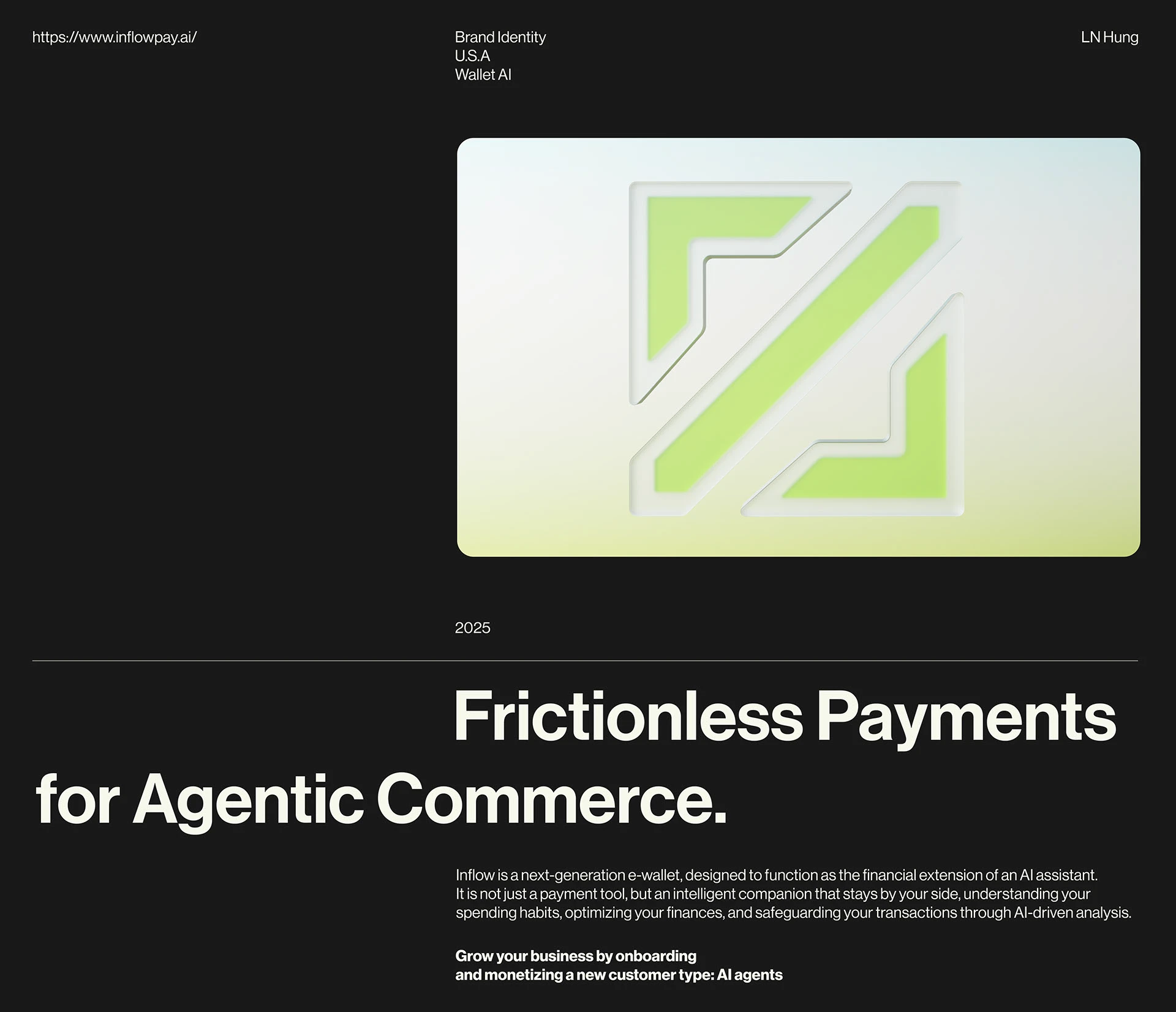
Inflow © 2025
/EN:
Inflow is a next-generation e-wallet, designed to function as the financial extension of an AI assistant. It is not just a payment tool, but an intelligent companion that stays by your side, understanding your spending habits, optimizing your finances, and safeguarding your transactions through AI-driven analysis.
/VI:
Inflow là ví điện tử thế hệ mới, hoạt động như “cánh tay tài chính” của một trợ lý AI. Inflow không chỉ là một công cụ thanh toán, mà là một trợ lý thông minh theo sát người dùng, hiểu hành vi, tối ưu chi tiêu và bảo vệ tài chính bằng phân tích AI.
Brand Concept
/EN:
The brand spirit is built on three core principles:
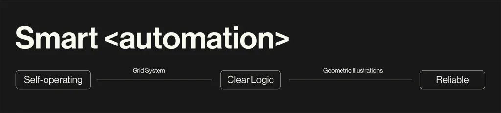
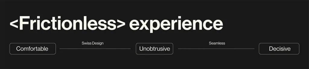
High speed, intelligent automation, and a seamless, frictionless.
These are not merely surface-level values, but the foundational pillars that shape how Inflow operates, evolves, and connects with its users. High speed is reflected in the system’s ability to respond and process tasks rapidly, helping users minimize waiting time and maximize productivity. Intelligent automation enables Inflow to function as a system that continuously learns, anticipates, and proactively handles tasks rather than simply reacting, thereby reducing errors and enhancing consistency. Finally, the seamless, barrier-free experience represents a commitment to a user journey that is simple and intuitive, where every interaction is smooth, straightforward, and uninterrupted.
Together, these three elements define Inflow’s unique identity: a modern, adaptive brand that places user experience at its core, ensuring that every interaction is fast, intelligent, and effortlessly fluid.
/VI:
Tinh thần thương hiệu được xây dựng trên ba ý niệm cốt lõi:
Tốc độ cao, tự động hóa thông minh và trải nghiệm mượt mà không rào cản.
Đây không chỉ là những giá trị bề nổi, mà là hệ trụ vững chắc định hình cách Inflow hoạt động, phát triển và kết nối với người dùng. Tốc độ cao thể hiện ở khả năng phản hồi và xử lý tác vụ nhanh chóng, giúp người dùng rút ngắn thời gian chờ đợi và tối ưu hiệu suất công việc. Tự động hóa thông minh giúp Inflow vận hành như một hệ thống luôn học hỏi, dự đoán và chủ động xử lý thay vì chỉ phản ứng, từ đó giảm thiểu sai sót và tăng tính nhất quán. Cuối cùng, trải nghiệm mượt mà không rào cản là cam kết về một hành trình người dùng đơn giản, trực quan, nơi mọi thao tác đều liền mạch, không phức tạp, không gián đoạn.
Logo
/EN:
The Logomark is inspired by the opening and closing symbols </> in programming, an emblem of structure, order, and logic. Translated into design, this symbol is stylized into the image of a stream entering the digital realm, representing the flow of finance and value within the Inflow ecosystem.
The Wordmark embraces the modern, neutral character of Swiss Style, featuring clean lines, low contrast, and a structure optimized for readability. Together, they create a clear, trustworthy, and enduring visual identity that maintains timeless aesthetics across all applications.
/VI:
Logomark được lấy cảm hứng từ ký hiệu đóng/mở </> trong ngôn ngữ lập trình, biểu tượng của cấu trúc, trật tự và logic. Khi được chuyển hóa sang thiết kế, cặp ký hiệu này được cách điệu thành hình ảnh của một dòng chảy bước vào không gian kỹ thuật số: dòng chảy của tài chính và của giá trị khi đi vào hệ sinh thái Inflow.
Wordmark giữ tinh thần hiện đại và trung tính của Swiss Style, với đường nét sạch, độ tương phản thấp và cấu trúc chữ tối ưu cho khả năng đọc. Sự kết hợp này tạo nên diện mạo rõ ràng, tin cậy và bền vững, đồng thời duy trì tính thẩm mỹ vượt thời gian.
Illustration System
EN/:
The illustration system uses abstract visual forms, primarily stylized and transformed cube structures. Thanks to their flexibility, these elements can adapt seamlessly to various contexts, from product interfaces and marketing materials to internal documents. The cubes not only symbolize structure and technology but also establish a cohesive, modern, and direction-oriented visual language.
VI/:
Sử dụng các hình vẽ mang tính trừu tượng, chủ yếu là những khối lập phương được cách điệu và biến tấu theo nhiều dạng khác nhau. Nhờ tính linh hoạt này, hệ thống minh họa có thể dễ dàng thích ứng với nhiều bối cảnh, từ giao diện sản phẩm, truyền thông cho đến tài liệu nội bộ. Các khối hình vừa mang tính biểu tượng cho cấu trúc và công nghệ, vừa tạo nên một ngôn ngữ thị giác nhất quán, hiện đại và giàu tính định hướng.
Grid System
EN/:
The design system uses a 16x grid, creating a clear, consistent, and scalable structure across all layouts. With units divided in multiples of 16, this grid ensures balance and precision in alignment, while providing the flexibility needed to adapt to various design formats. It serves as the foundation that keeps Inflow’s visual identity cohesive and professional across every touchpoint.
VI/:
Hệ thống thiết kế sử dụng grid 16x, giúp tạo nên cấu trúc rõ ràng, nhất quán và dễ dàng mở rộng trong mọi bố cục. Với các đơn vị được chia nhỏ theo bội số của 16, lưới này đảm bảo tính cân bằng và chính xác khi căn chỉnh, đồng thời cung cấp sự linh hoạt cần thiết để thích ứng với nhiều định dạng thiết kế khác nhau. Đây là nền tảng giúp toàn bộ nhận diện Inflow duy trì sự mạch lạc và chuyên nghiệp trên mọi điểm chạm.
Client: INFLOW
Scope of Work: Logo & Visual Identity System.
Art Direction: Hung Le.
Creative Designer: Hung Le.
3D Designer: Ng Truong
Special thanks to Mr.Tuấn Dương for the support throughout this project.
Mockup: Mockups Directory & Alex Paliotta
Project Owner: Dang Phong
—
Inflow © 2025
https://www.inflowpay.ai/


